
Beer is mostly water. But through the magic of Saccharomyces cerevisiae consuming sugars provided by malted grains, that water becomes something wonderful. While the malt provides a lot of the body and the flavour of the beer, it’s with the addition of hops that beers become truly exciting in their varied characters.
The hop plant is Humulus lupulus, a native of Eurasia that’s quite possibly been associated with booze since the 6th century BCE (check out this PDF) but has been cultivated extensively, resulting in an incredible range of aromas and tastes.
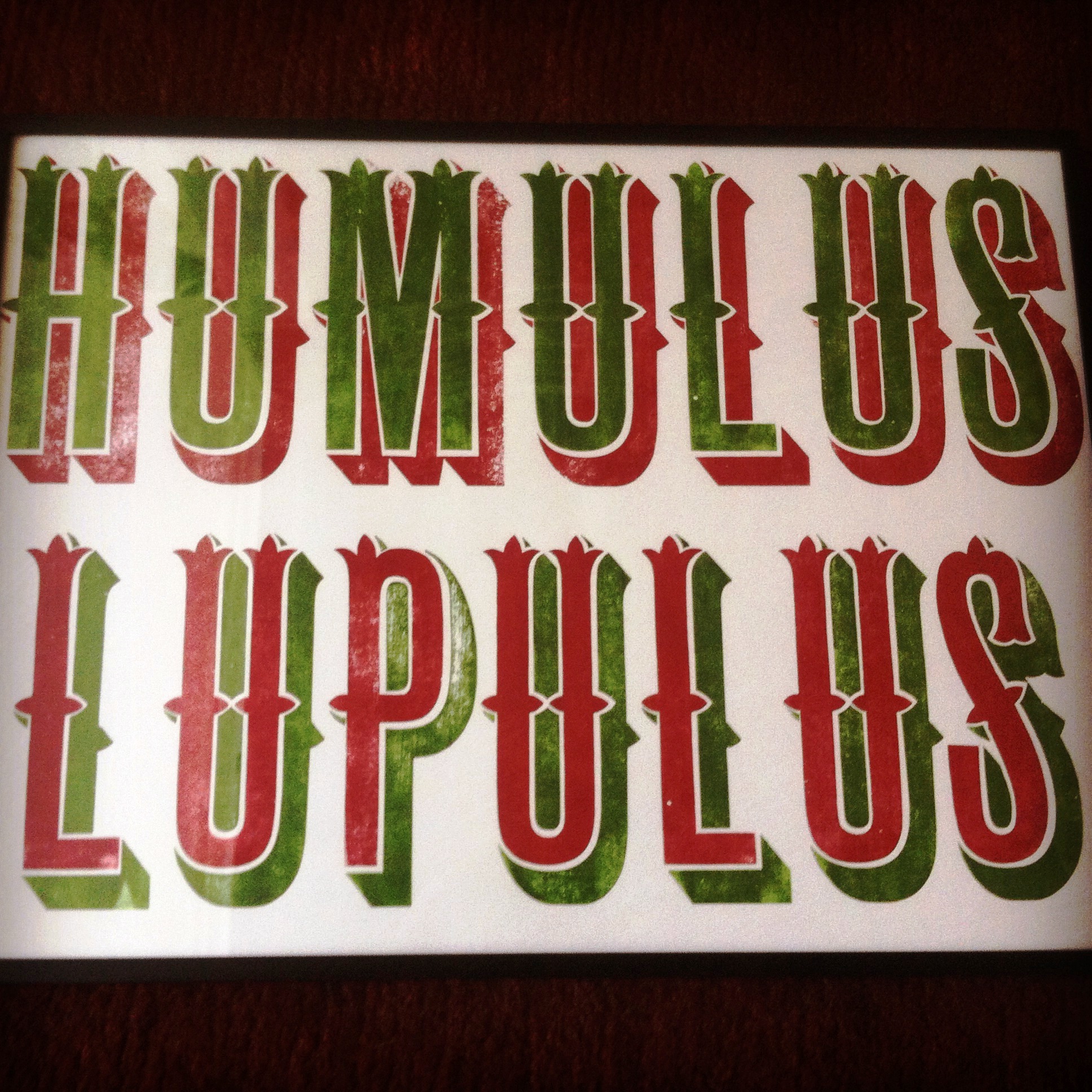
What you can do with hops is really something to be celebrated, which is just what Russell Frost has done with this new print from his Hooksmith letterpress operation.
Russell, an old friend from New Zealand and a fellow fan of decent real beer, explains, “The type face is allegedly a hand-cut early Chromatic Victorian (meaning for two-colour printing) known as an ‘ornamented grot'” Strangely, as “grot” is either short for grotto or grotty: these letters are neither.*
Russell has an extensive collection of vintage equipment as his operation in east London. For those who know their letterpress, his site says, “Presses include an Adana 8×5 platen and several proofing presses including a Farley, Stephenson Blake, Vandercook14 and a Vandercook SP15.”
As for the ornamented grot used here, Russell says, “I came by it after a serious amount of hunting and it was sold to me by a collector who bought it off another collector in the 1980s.”
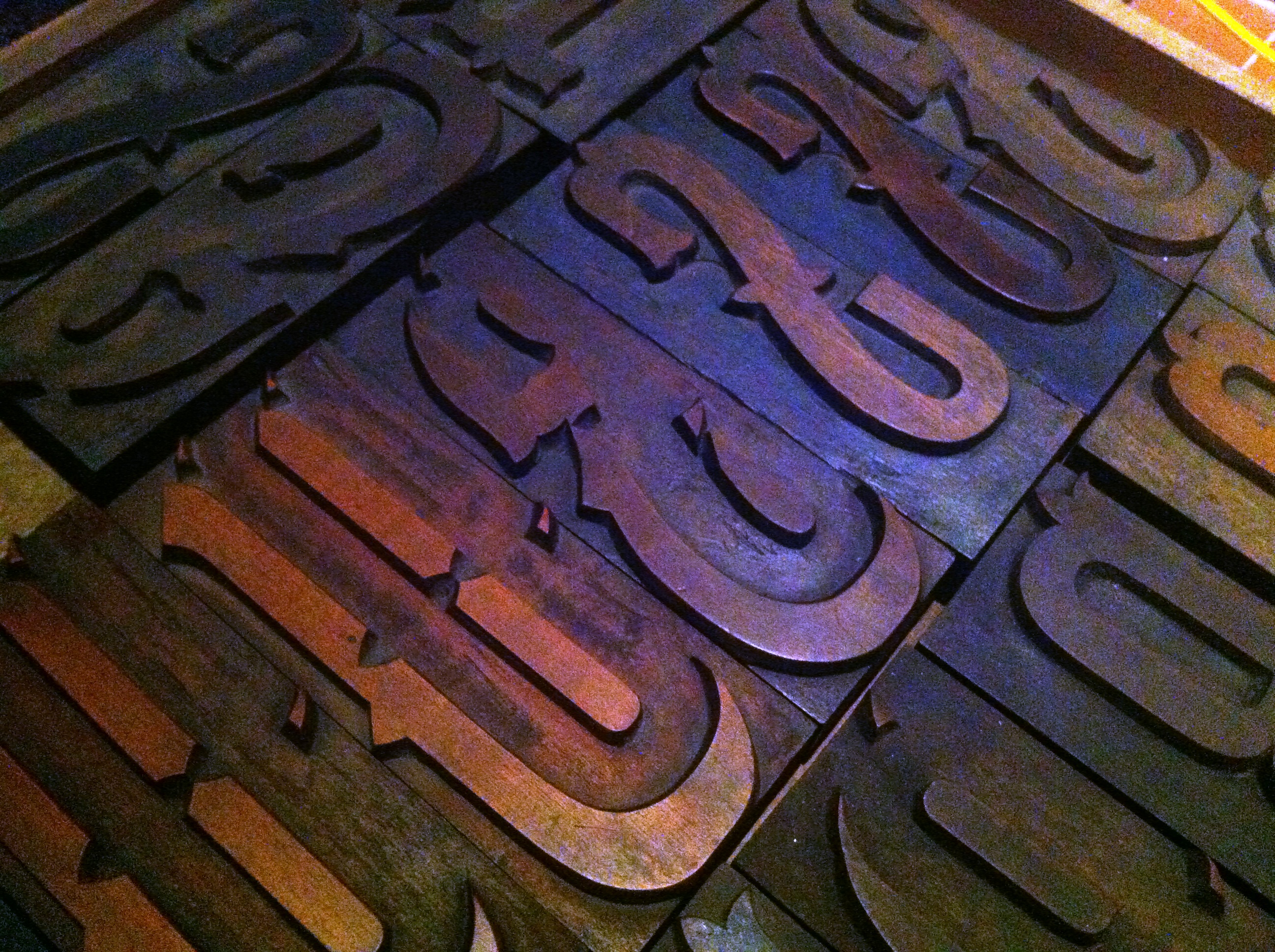
Great stuff. I particularly like how the decorative top tips of the letters reflect the pointed shape of the hop flower petals, as seen in this picture taken by a chap called Duncan Harris (thanks Duncan) and posted in his stream on Flickr:

Oh, and Russell, being an educated man and the son of a botanist, knows that it’s a no-no to capitalise scientific nomenclature (that is, put HUMULUS LUPULUS when it should always be Humulus lupulus or at a push H. lupulus), but it’s such a great font it’s justified by artistic license.
* Russell says “grot” is just short for “grotesque”, which makes sense. Grotesque doens’t just mean ugly or hideous, it originally referred to a decorative style that was inspired by ancient Roman decorative styles (re-) discovered during the Renaissance and featured bizarre, stylised animal and plant forms. Grotesque, grotto and grotty all have the same etymology – the Italian word grotta, cave, which comes from the Latin crypta (as in crypt) meaning underground passage or chamber. The 16th century artists who developed the grottesca / grotesque style had, for example, explored the buried rooms of places like Nero’s Golden Palace, which in the Middle Ages was largely lost and buried under the cumulative filth and silt of decades of neglect in Rome.

perfectly formed post, Dan. As are Russell’s prints. And hops. Am now very thirsty.
Thanks!